top of page
Play Video
7/2016
Species Interaction Mapping
A concept for visualising interspecific interactions within an ecosystem
Ecosystem collapses, biodiversity decline, and climate change – prevalent developments in the Anthropocene – are perceived as the biggest environmental problems our planet is facing. As these three processes are interwoven with each other, this project aims a visualising their interrelation. A concept for a research tool has been created which depicts how environmental factors such as climate fluctuations and human impact influence ecosystem dynamics – in the past as well as in the future.

Creating a semiotic language for network visualisations
Complex network visualisations – despite their intention to communicate lots of data points in a visually engaging way – often face the problem of information overload. Colour encoding, filter options, zooming in and out as well as hovering over entities assist users in exploring networks without being constantly overwhelmed. As ecological networks are comprised of species with various characteristics that are interconnected with each other in different types of relationships, a semiotic visual language has been defined in order to distinguish between characteristics in an efficient and intuitive way.


With a focus group consisting of ecology researchers or students, the visual encoding intends to assist users in exploring networks and discover patterns or relationships. (C = Carnivore, H = Herbivore, P = Parasite, V = Vegetation)
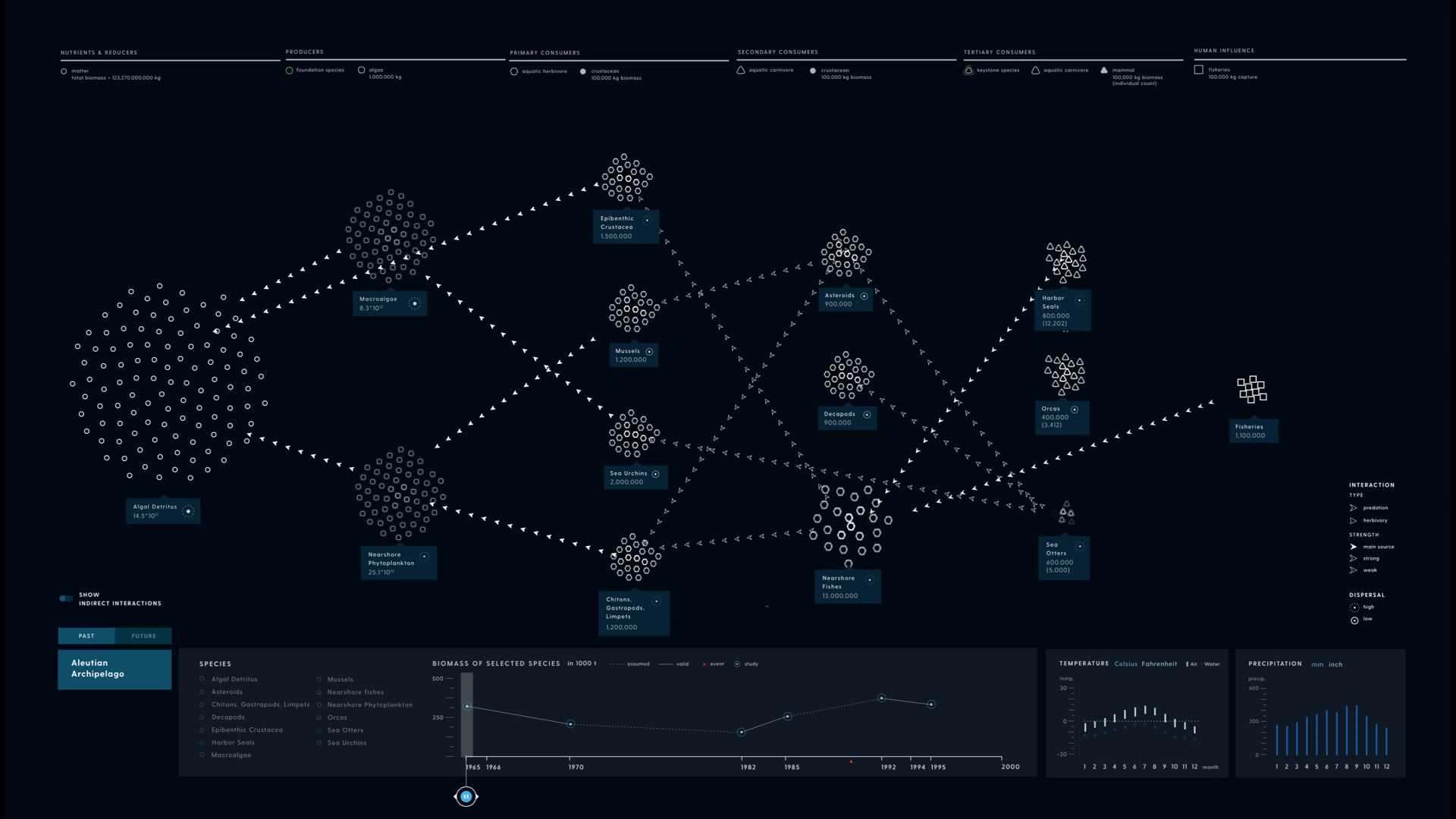
A minimalistic yet informative user interface
The horizontal layout of the network visualisation depicts the food chain within an ecological ecosystem, from small organisms on the left towards predators and humans on the right side. Other UI elements such as headers, labels, and environmental information panels present contextual information in a clean yet informative way.

A header above the network visualisation displays the trophic level of species within that vertical column (horizontal axis = trophic classification)

The label describes the organism (common name; hover displays the Latin name), as well as the population at that specific timeframe. The number in parenthesis describes the population in the present.

The feature of the application is the ability to travel through time and see how the ecosystem evolved as well as how the composition will become in the future. Moreover, the species composition is also shown on the bottom panel.

Air and water temperature are being displayed in monthly data intervals with the average value being shown on the right side.

An overlay gives information about the habitat itself, including meteorological data such as temperature and precipitation range.
Thanks to:
Prof Eva Vitting (supervisor)
Prof Oliver Wrede (co-supervisor)
bottom of page